Home / Sketchbook / Mixing natural greens
Stop 3: sap green
How do you mix natural greens for landscape watercolour?
Use three paints rather than two: a blue, a yellow, and a touch of something warm or earthy to stop the mix shouting. Then make it darker and duller than you think it should be.
The editors, 4 August 2026. About 4 minutes.
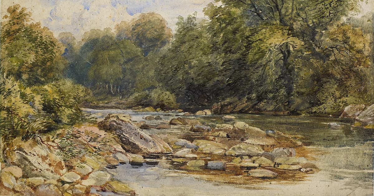
Greens go wrong for most beginners for one of two reasons. They use a tube green straight from the box, or they mix a clean blue with a clean yellow and stop there. Both give a bright, cheerful colour that sits on the paper like a sticker. The fix is a third paint: a small touch of an earth or a red that takes the edge off, followed by a good hard look at how dark the real hedge actually is.
That second part is harder than the mixing. Bruce MacEvoy's essay on mixing green makes the point well: what we carry in our heads is a "color idea", the green a leaf ought to be, while foliage greens are "much darker and duller than we remember them". He also argues directly that green mixtures need three paints, which is the reason this article is built around three.
Recipe cards
These all use the six-colour box from our outdoor kit list. Proportions are by eye, so treat them as starting points. Test every mix on a scrap before it touches the page.
Wet pasture in spring
Lemon yellow with a little ultramarine. A speck of burnt sienna once it looks too fresh. Keep it thin, and let the paper light it from behind.
Summer hedge, in shade
Ultramarine with yellow ochre, heavier on the blue. Add burnt sienna until the mix nearly goes grey, then stop. This is the colour most beginners never dare to use.
Late-season oak or ash
Raw sienna with a little ultramarine. Let it stay warm, and drop in more sienna while the wash is damp so that it goes patchy.
Far woodland
Ultramarine with a very small amount of yellow, heavily diluted. MacEvoy notes that ultramarine with yellow makes dark, near-grey greens that suit distant trees. Our article on distant hills explains why that works.
Paint your own chart
The chart above is a screen approximation. Yours will differ with every brand, because the name on the pan says little about the pigment inside. So spend twenty minutes making one, using the actual paints you own, on a sheet of the paper you actually use:
- Rule a grid with your yellows along the top and your blues down the side.
- Mix each pair in the palette and paint a square. Do not mix on the paper.
- Below each square, paint a second one with a touch of burnt sienna added.
- Below that, a third with a touch more, and a little extra water.
- Let it dry fully, and write the names in pencil.
Drying is the part you must not skip. Green mixtures, as MacEvoy warns, often dry noticeably lighter and duller than they look wet. You need to know how much your own mix fades, since you will be judging a wet patch against a real field.
What the third colour does
A blue and a yellow give the hue of a green. The third paint changes how much it shouts. These are the usual candidates, with notes based on the same handprint essay:
- Burnt sienna warms and greys the mix. Too much pushes the green back towards yellow-brown, which can be just right for dying bracken.
- Burnt umber is another warm, dark option if you find yourself needing depth without bulk.
- A yellow earth such as raw sienna or yellow ochre can stand in for the yellow altogether, and so builds in the dullness from the start. Both are common ingredients of subdued natural greens.
- A red in a tiny quantity also neutralises a green, because red sits opposite it. It takes care: a little too much and you have mud.
When a tube green is worth having
Not all tube greens are the enemy. A bright, transparent green can be useful as a base if you remember to treat it as an ingredient. Winsor & Newton's colour story on viridian describes an intense bluish-green that yields a range of natural greens when mixed with yellow, orange or red. MacEvoy similarly suggests sap green as a kind of home base, near the middle of natural greens and easily pushed towards yellow, blue or red.
If you buy one, buy one. Having several greens in the box mainly tempts you to reach for them, and six separate greens on one page look like six separate greens.
Three habits that help outdoors
Paint temperature, not leaves. Look for where the tree is warm and where it is cool. A wash that drifts from warm yellow-green to cool blue-green says more about an oak than any number of small marks.
Mix more than you need. A second batch never quite matches, and a tree that changes colour halfway across looks like an accident. A puddle costs almost nothing.
Use the darks earlier than feels safe. The most common beginner's green problem is a lack of contrast rather than a wrong hue. A really dark shadow under a hedge makes the field beside it look brighter, without changing a drop of the field. You can plan where those darks fall with a quick thumbnail before you start.
Look at the banks of trees in the painting above and try counting the greens. Some of them are hardly green at all, and that is the reason the whole thing reads as summer.