Home / Sketchbook / Painting distant hills
Stop 5: ultramarine
Why do distant hills look blue, and how do you paint them?
There is more air between you and a far ridge, and that air scatters light towards your eye. So each ridge back gets paler, cooler and softer. Paint exactly that, starting from the furthest.
The editors, 22 September 2026. About 5 minutes.
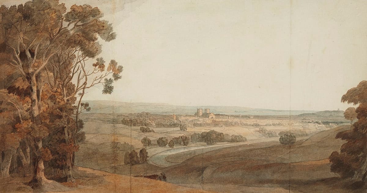
Distant hills look blue because of the air in front of them. Between you and a far ridge there are miles of atmosphere, and that atmosphere scatters short-wavelength blue light far more than red. Some of that scattered blue reaches your eye from the air along your line of sight, and it settles over the hill like a very thin wash. The further away the hill, the thicker the wash. Painters call this aerial or atmospheric perspective, and it is the most useful trick in landscape.
The physics, briefly
The Met Office's explanation of why the sky is blue gives the mechanism: gas molecules in the air, much smaller than the wavelength of visible light, scatter short wavelengths far more than long ones. That is Rayleigh scattering. A perception tutorial hosted by Hanover College connects it to what we see at a distance: scattering makes far objects look less distinct, and gives them a bluish cast.
The effect has been noticed by painters for a long time. The National Gallery's glossary entry notes that Leonardo and others studied it, and traces its first use in painting to early 15th-century Netherlandish work, where gradual tonal changes between foreground and background gave a sense of depth. Six hundred years on, a watercolourist in the Pennines is doing much the same thing, with less oil and more drizzle.
Four dials to turn
Think of distance as four separate dials. Turn all of them together as you go back through the view.
- Value
- Far things are lighter. In watercolour this means more water, not more white. It is the most powerful dial of the four, and it works even in a monochrome sketch.
- Temperature
- Far things are cooler. Move from warm browns and yellow-greens near you to greys and blue-greys in the distance.
- Edges
- Far things are softer, and contrast within them is lower. Near shapes can have hard, crisp edges, and these will come forward.
- Detail
- Far things have less of it. A distant wood is a single shape with no trees in it. Save your twigs for the front.
Painting a layered view, back to front
This is a good exercise for a first outing because it only needs one or two pigments and a pale sky. Use the best paper you have, since washes show everything.
- Draw three or four ridge lines. Very lightly. Let them overlap so that each one hides the foot of the one behind. A thumbnail first will tell you how much sky you want.
- Paint the sky and let it dry. If you leave it damp, the far ridge will bleed. That can look lovely, but it is worth learning the dry version first.
- Mix a large puddle of grey-blue. Ultramarine with a touch of burnt sienna works well. Paint the furthest ridge with this very dilute, and take it right down past where the next ridge will sit.
- Dry it, then go forward. Add more pigment and a little warmth to the same puddle. Paint the next ridge, again running past the lower line.
- Repeat, getting warmer and darker. Add some yellow earth. The nearest ridge can have a real green from our recipe cards, with a broken, textured edge.
- Stop before you add detail to the middle. One small dark mark at the very front (a fence post, a thorn tree) will do more than a dozen in the distance.
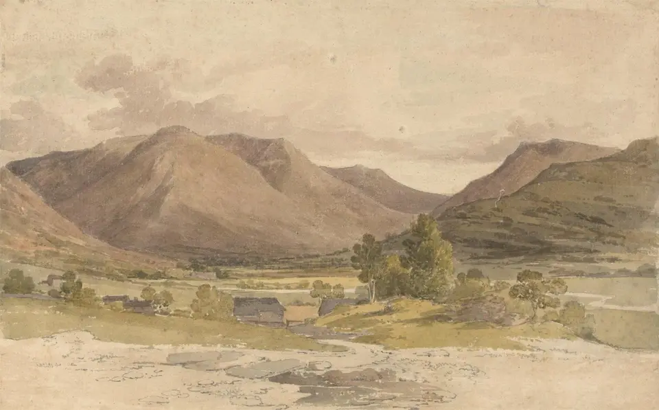

Paul Sandby Munn's Patterdale sheet, painted in 1802, shows how restrained this can be. The mountains are in fairly quiet browns rather than blues, yet they sit well behind the farm because they are simple, soft and pale compared with the darker tones below them. Blue is optional. The drop in value and contrast is what carries the distance.
Do not paint from a formula
Distant hills are not always blue. The Met Office page explains that when the sun is low, its light has crossed a thick layer of atmosphere that has scattered the blues away, leaving reds and oranges. So an evening ridge may appear warm violet or dusty pink. On a clear, cold day after rain a hill many miles away can look startlingly close and sharp, and in low cloud the far ridge can vanish altogether.
The sky also tends to be paler near the horizon, as the same page notes, because light from there has passed through more atmosphere and been scattered repeatedly. It is a small point that makes a large difference: grade your sky so that it fades as it comes down, and your far ridge will sit against a pale band rather than a flat blue wall.
So use the rule as a question. How much paler is that ridge than the one in front? Is it actually blue, or is it just cooler? Hold up a finger, compare the two, and paint what you find rather than what you know.
Three ways it commonly goes wrong
Every ridge looks the same strength. Beginners tend to be too timid at the front and too heavy at the back. Exaggerate the difference. Your first far ridge should look almost too pale while wet, and will dry paler still.
The far hill has hard edges and small fields on it. Crisp detail jumps forward, whatever colour it is. Leave the walls and barns out.
The front is pale too. Without a true dark nearby, the distance has nothing to recede from. If you are nervous of strong paint, try it once on a practice sheet from the bag you packed using our kit list, and see how far you can push it before it goes wrong. It is usually further than you think.